| Client: | 12grapes GmbH / bunch.ai |
| Deliverables: | Product application (v1.0) |
| Time: | April 2017 - Aug 2017 |
| Team: | Product owner, UX designer, Content writer, Engineer |
| My role: | User Research, UI Design, UI Engineering (React) |
Introduction
Bunch is a team management platform that helps high-growth companies to develop a strong culture. Bunch maps a team’s culture baseline, allowing companies to screen all candidates for team fit and predict their impact on culture and performance.
The platform enables companies to create highly-aligned teams and shape their culture to boost business growth.
Problem space
- Create an experience that empowers hiring managers and team leaders to make informed decisions about hiring
- Users should be able to send questionnaire invitations to job candidates and team members
- Completing the questionnaire reveals candidate’s personal profiles
Research
Since Bunch started shifting focus away from hiring into team dynamics, we needed to re-evaluate and extend our previous research. We started with user interviews and an extensive competitor research.
I started with an extensive look at competitors in the HR industry which gave us deep insights from marketing and product side. We screened 43 competitors, ranging from team surveys, HR tools, performance management tools and BI tools to communication analysis tools. We found that not many use machine learning to drive hiring process or assess team culture.
Problems defined
- How to make the questionnaire experience easy and valuable?
- How to ensure the trustworthiness of the results shown in the profile?
- How to provide meaningful recommendations and actionable items based on the profile results?
- How to ensure data privacy?
Goals
- Transform consultancy type business model into SaaS
- Provide valuable insights into results
Target audience
- Hiring managers
- Team leaders
- Job candidates
- Team members
User research and ideation
We conducted 20+ user and customer development interviews to get key insights into pain points of team leaders in team management and hiring. Interviews were done in person or remotely. We used those to create our personas and map their user journey.
The whole team then conducted design sprints to discover:
- What’s the best approach for quiz usability aimed at team members and job candidates
- What kind of actionable insights might help team leaders and hiring managers to improve teams
- What kind of information would team members like to see about the team they’re in
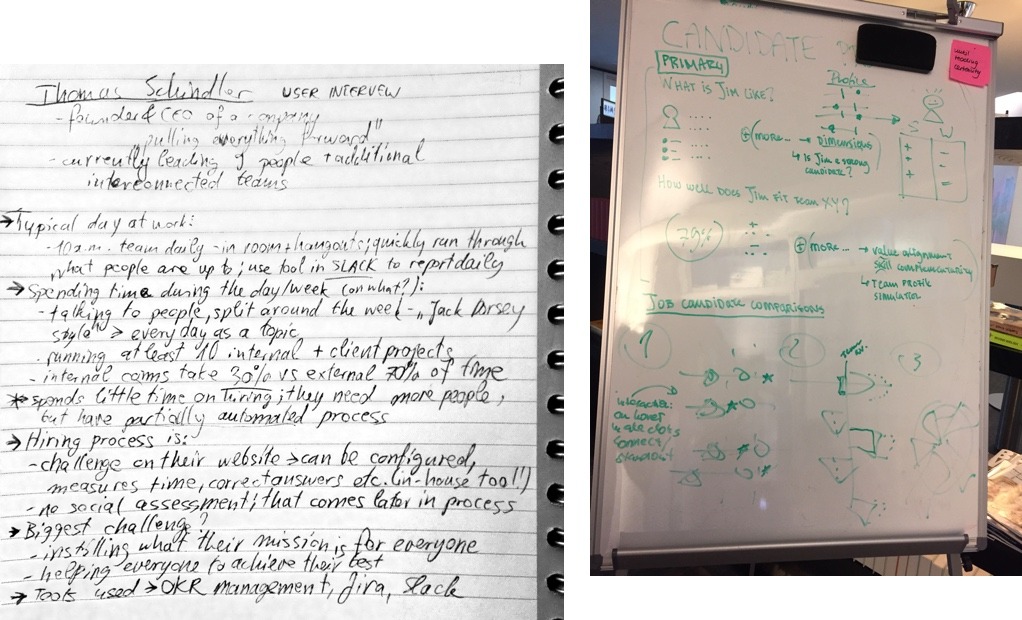 Research notes
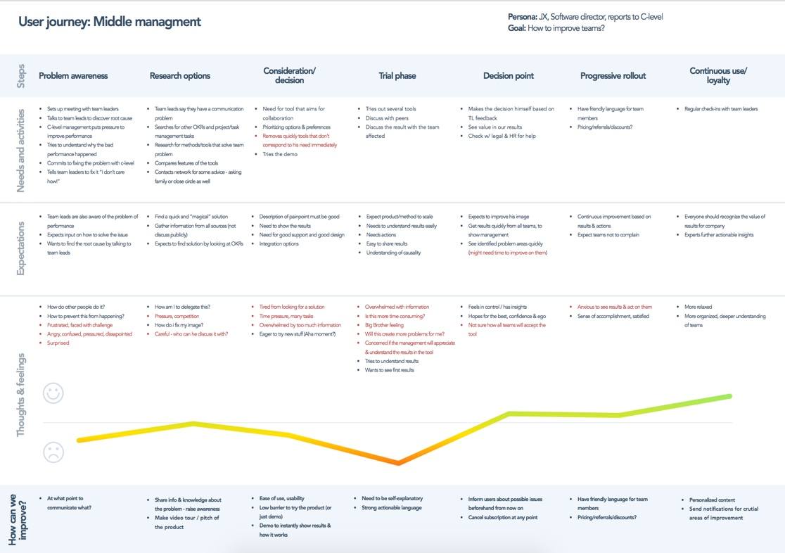 User journey for middle management persona
Key Findings
Following findings were discovered during the research:
- The hiring and team management processes vary greatly from company to company; there is no silver bullet
- There is a problem with the trustworthiness of psychological models and methodologies
- Team members might feel intimidated by the analysis of their communication channels
- There are privacy concerns for profile creation based on the questionnaire as well as communication analysis
- Social proof plays a big role in the perception of the product
With all the data collected by initial research and through design sprints, we shifted focus on the problem of defining and building team culture, with target audience being team leaders, team members and job candidates. Once the initial set of features that we wanted to test was agreed on by the team and product manager, we decided to parallelize the work where possible.
To speed up execution work, the wireframes tested by another UX designer, while I started focusing on UI design.
UI design
UI design for the application was defined by me, based on the brand guidelines done by an outside agency.
Pattern Library
While the lo-fi prototype was being tested and improved, I started working on the pattern library and design system for Bunch product. The pattern library is based on the Atomic Design concept where we defined small individual elements that can be used to build bigger ones. The master Sketch file was used for making updates and sharing them through Craft library to all team members.
The publicly available style guide https://styleguide.bunch.ai/ was set up as part of the project using React Storybook. The pattern library consists of the following sections:
- Identity : The core brand elements to be used throughout the app.
- Elements : Smallest reusable parts in the project, with all their states, defined.
- Components : Screen blocks; anything that uses at least a few elements, modular or not. Should come with defined breakpoints straight away.
- Compositions : Parts comprised of multiple components; they define how components inside should behave.
- Layouts: Actual screens of the project - each page consists of an arrangement of Compositions and Components.
 Bunch component library in Sketch
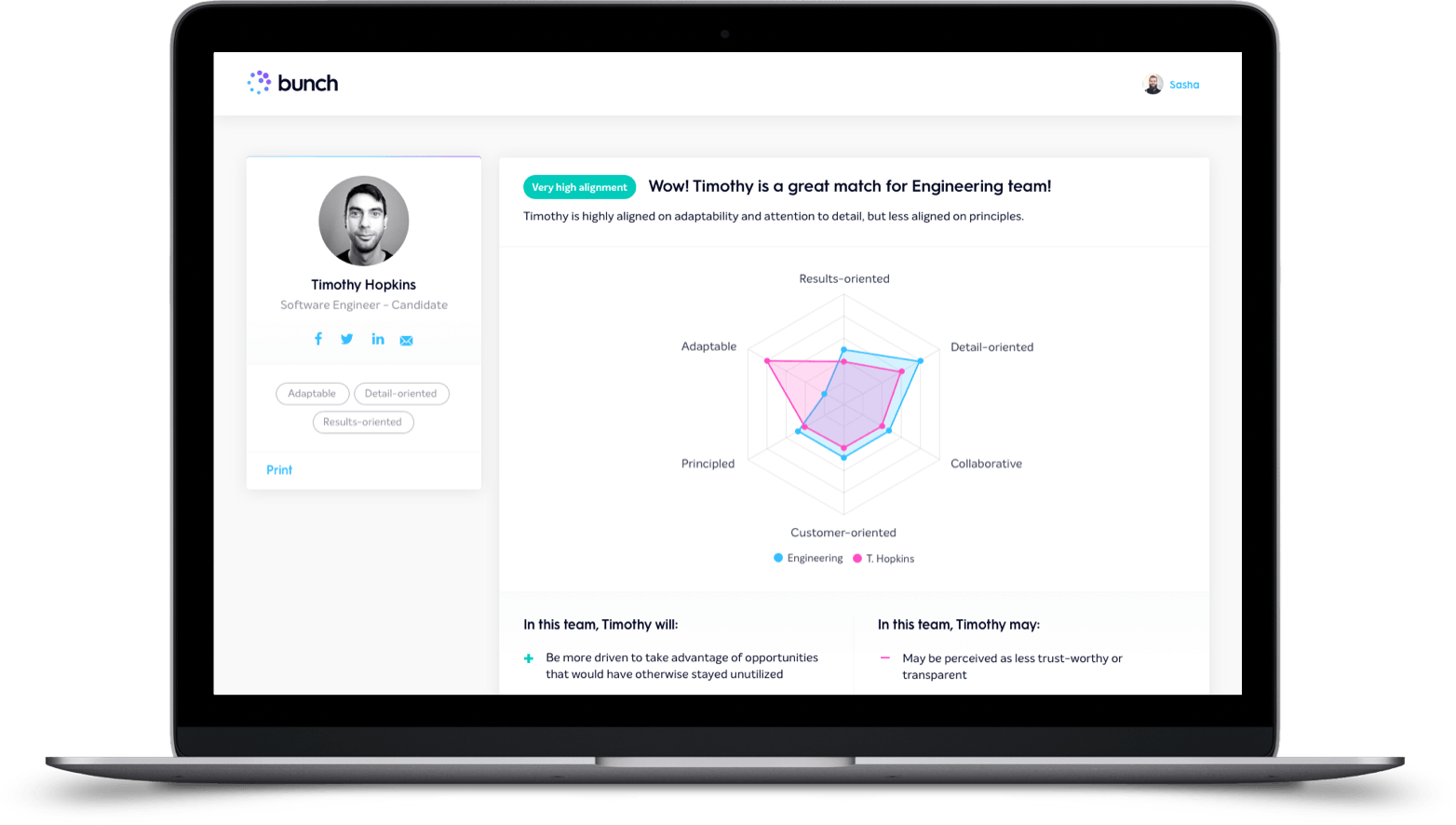
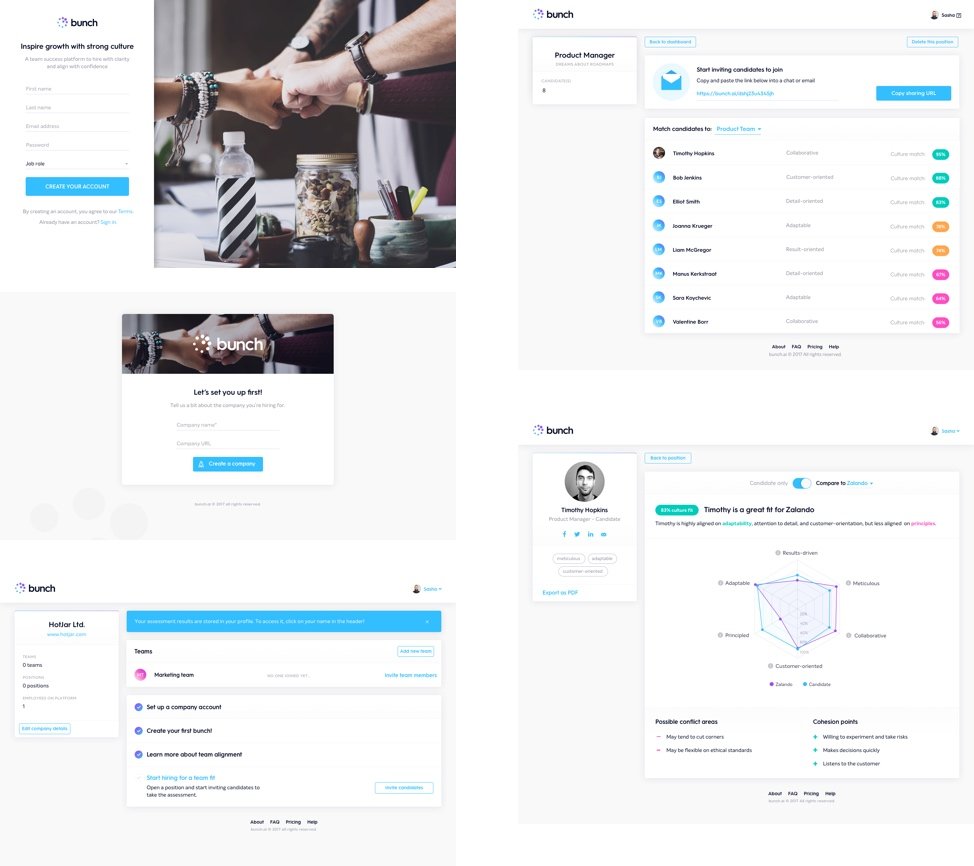 Bunch application UI
Project outcomes
Having a governed design system embedded in the project helped us to get new features off the ground more quickly and ensured easier knowledge transfer between team members. Product usability was improved by putting more focus on the needs on specific target user roles.
Website responsiveness enabled the use on mobile devices; this was especially important for profile creators (job candidates and team members). The existing clients gave generally positive feedback to the updated look and feel of the product and page analytics showed successful use of the navigation patterns for viewing profiles.
Key finding for the team workflow was that the structured environment of design sprints can foster the ideation process, but not all parts of the methodology can be applied to every problem.
Check out my other case studies:
- Increasing platform use with visual testing Sauce Labs
- Discovery for the in-house use product dunnhumby Media
- Designing a solution for querying data Memgraph Lab
- Building demo applications to help GTM motion Memgraph
- Finding product market fit for an early-stage idea Bunch.ai
- Product engagement optimization Powerlinx
Back to projects