| Client: | CB Alliance / Powerlinx Ltd |
| Deliverables: | Product application (v2.0) |
| Time: | Jan 2016 - Aug 2016 |
| Team: | Product manager, 2 marketing & content managers, 5 engineers |
| My role: | UX&UI Designer, Front-End (HTML/SCSS) |
Introduction
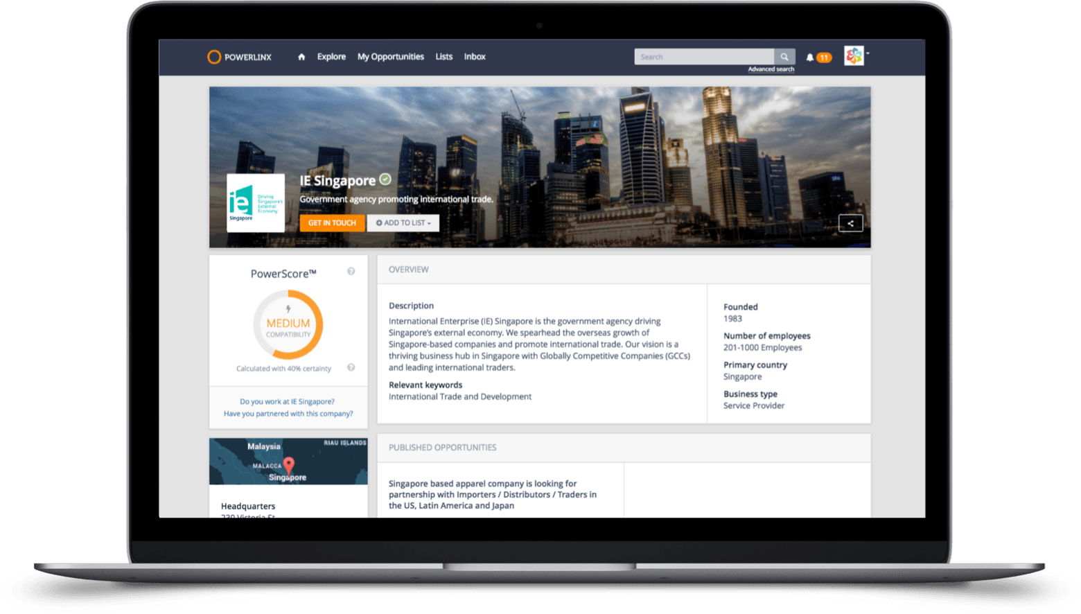
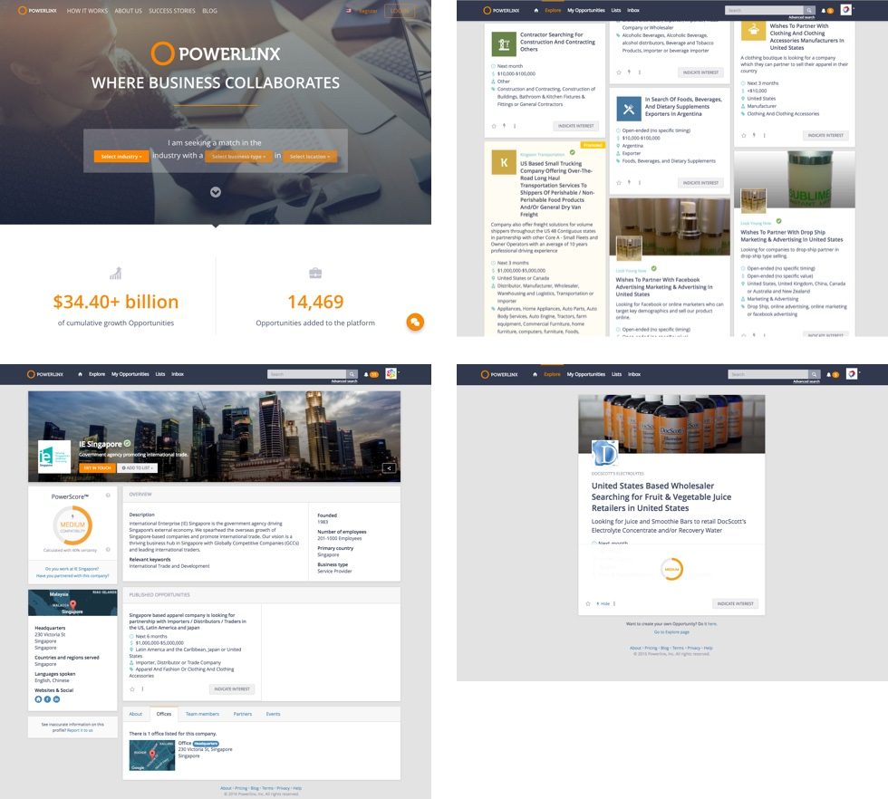
Powerlinx is an award-winning global online platform that empowers companies to identify and connect with their ideal strategic partners and discover relevant business opportunities across 50+ million companies.
Business owners can find relevant potential business partners and facilitate introductions either on or off the platform. The app interface, as well as content on the platform, is multilingual to drive the global markets.
Problem space
After the initial release, we faced the number of active users declining. With the introduction of the Opportunities functionality, we wanted to engage them to fine-tune their search for business partners. Additional data should also allow us to better hone our PowerScore match recommendation engine.
Research
We needed a deep understanding of what is important to people across industries when considering a business partnership. The focus was on small and medium-sized companies who want to cut expenses when doing due diligence.
The competitor research revealed that there are competitors who are aiming at a global market, but few of them focus on nurturing business partnerships from start to finish.
Problems define
- How can users stop struggling to clearly define their business goals?
- How to reduce manual effort of making introductions to companies?
- How to ensure data privacy and anonymity levels for business?
- How to deal with user and account management within the business?
Goals
- Normalize data incoming from different sources into consistent dataset
- Make the process of finding and reaching out to companies as smooth as possible
Target audience
- Business Owners
- Advisors
- Business Consultants
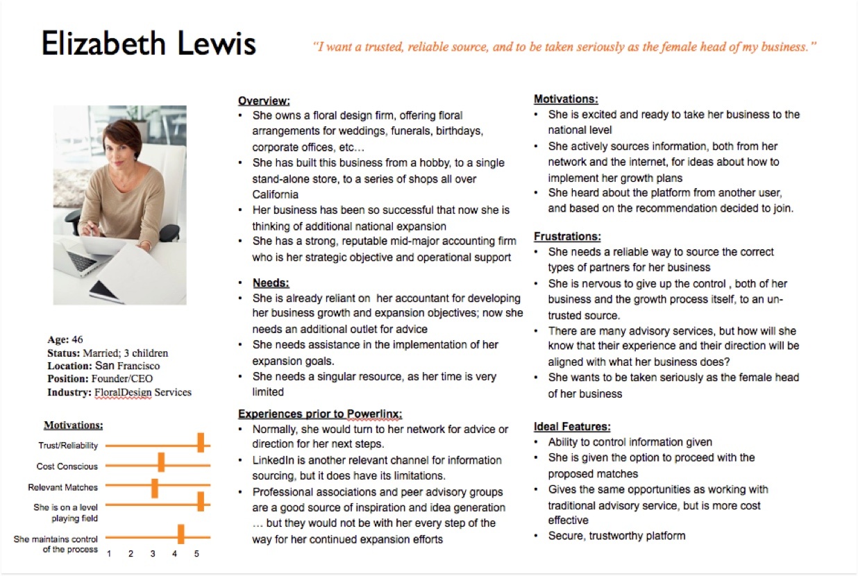
Provisional product persona was created as an outcome of the user research and updated based on new findings.
Ideation
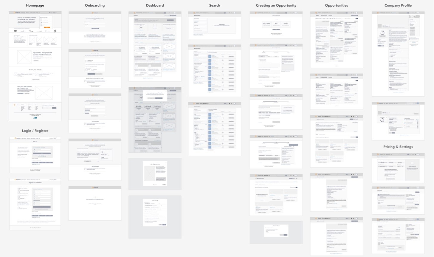
Ideation process included generating different ideas for displaying the Opportunity information, and also displaying the supporting user flows that would need to change in the application. The wireframes for the affected areas of the application were tested and changed in several iterations by the product manager and myself.
Content delivery
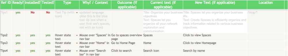
Due to the project size and language support, as well as the size of the team, we needed to establish a clear process for creating and managing content. I’ve set up microcopy tables that helped to support the UI in the multilingual environment.
UI design
The UI design followed already established look and feel of the application, with the introduction of some new components such as opportunity cards.
Usability testing
Process
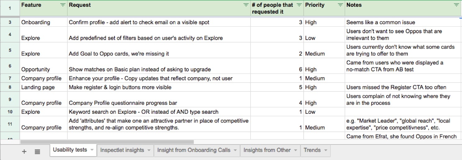
During the course of the project, we were always striving to get user feedback on the features in development. I organized on-site or remote usability screeners with prospective clients or existing users. The goal was to find the behavioral patterns in how they do business and to find platform usability pain points. When it comes to feature requests or bug reports, we prioritized them based on the frequency of occurrence in feedback, as well as their gravity.
Project outcomes
- Within one year, the number of created accounts grew from around 12k to 38k.
- The in-app engagement level has improved for web and mobile users by enabling companies to publish Opportunities for their companies; it provided an incentive to visit the app more often.
- The onboarding process including setting up Opportunities needed to better set expectations about the app value over time - this was considered as entry barrier.
Check out my other case studies:
- Increasing platform use with visual testing Sauce Labs
- Discovery for the in-house use product dunnhumby Media
- Designing a solution for querying data Memgraph Lab
- Building demo applications to help GTM motion Memgraph
- Finding product market fit for an early-stage idea Bunch.ai
- Product engagement optimization Powerlinx
Back to projects